The font used through out the Sequence was Corbel. It was all bold and centred. The size depended on shot. Each title had an Black Solid Outerstoke with the width of 15. Only the title of the movie had a blue shadow to it.
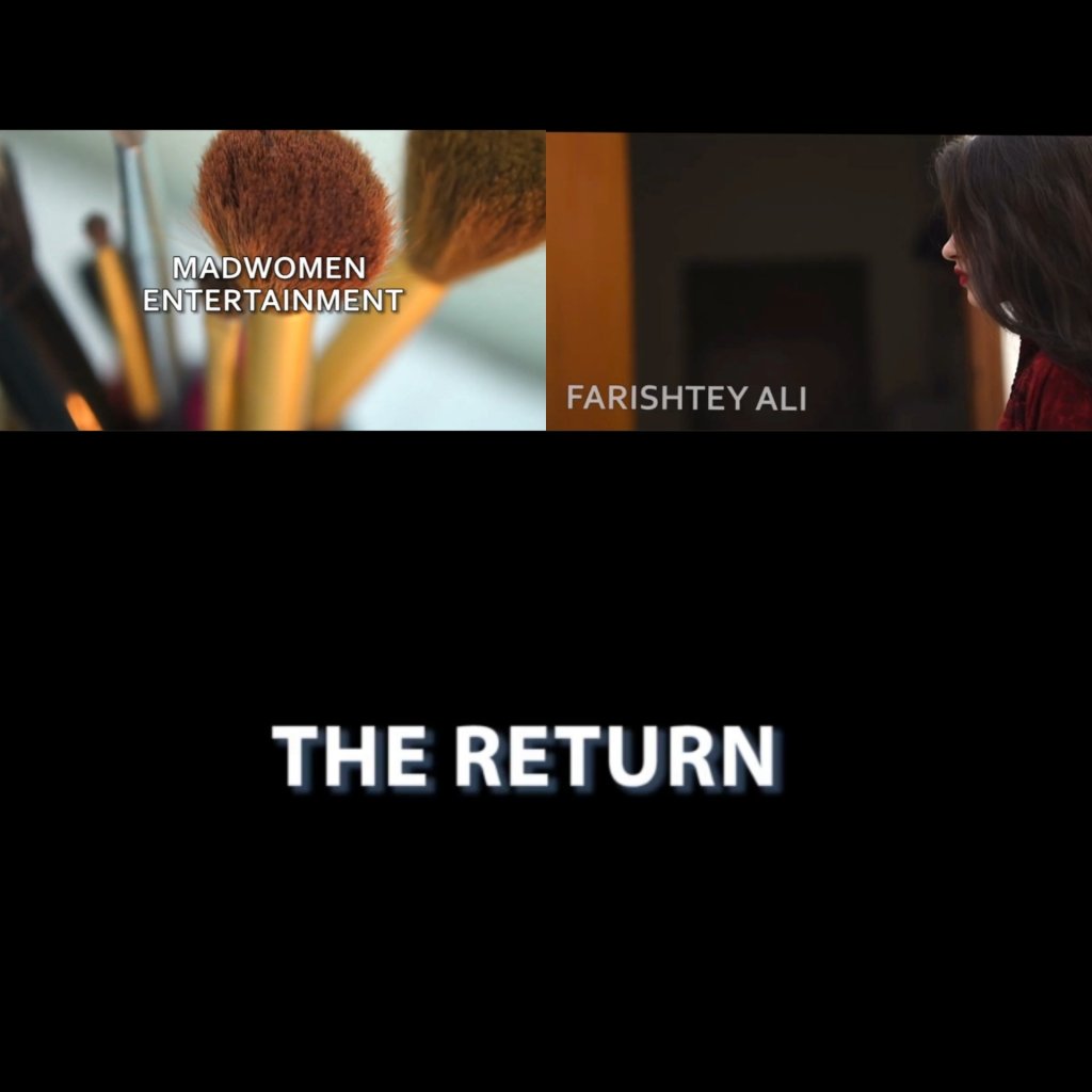
The font used through out the Sequence was Corbel. It was all bold and centred. The size depended on shot. Each title had an Black Solid Outerstoke with the width of 15. Only the title of the movie had a blue shadow to it.
